Case Studies: Website Transformations for Automotive and Hospitality Clients
A website transformation involves more than replacing an old layout with a modern design. For automotive and hospitality businesses, the website plays a direct role in how customers discover, evaluate and contact the brand. It must communicate quality, present detailed information and make the next step easy, whether that step is requesting a test drive, enquiring about a vehicle, checking room availability or making a reservation.
Automotive and hospitality businesses operate in different industries, but their customers share several expectations. They want to explore options visually, compare important details, confirm that the business is trustworthy and complete their journey without unnecessary difficulty.
A potential automotive customer may visit several websites before contacting a dealership. They may compare models, specifications, pricing, availability, financing options and after-sales support. A hotel or resort customer may examine room photographs, amenities, location, guest experiences, policies and booking conditions before making a reservation.
In both situations, the website must reduce uncertainty.
An outdated or confusing website can create doubt even when the underlying business provides an excellent service. Slow pages, weak mobile layouts, incomplete information and hidden calls to action can cause visitors to leave before they contact the company.
A successful transformation aligns brand strategy, visual design, content, development, search optimisation and conversion planning. It does not begin with colours and animation. It begins with understanding the customer journey and identifying where the existing website is failing to support it.
The following case studies illustrate how automotive and hospitality websites can be transformed into clearer, more useful and more conversion-focused digital platforms. They demonstrate the reasoning behind the redesign process, the challenges that commonly appear and the strategic decisions required to create a stronger customer experience.
Understanding the Purpose of a Website Transformation
Businesses often decide to redesign a website because it looks old. While visual appearance is important, it is rarely the only problem.
An outdated design may be a visible sign of deeper structural issues. The website may have been developed before mobile traffic became a priority. Important pages may be difficult to reach. The content may no longer reflect the current services, properties, products or market positioning.
A redesign that changes only the surface can leave these problems unresolved.
A website transformation should begin by examining what the platform needs to achieve. The business may want more qualified enquiries, direct bookings, test-drive requests, service appointments, brochure downloads or dealership visits.
Once the commercial objective is clear, the website can be evaluated against it.
The review should examine how visitors enter the site, what information they need and what prevents them from acting. Analytics may reveal that many users leave particular pages. Customer-service teams may report that visitors repeatedly ask questions already supposed to be answered online. Sales teams may receive enquiries from people who misunderstood the offering.
These signals help define the transformation strategy.
A strong redesign maintains anything that is already working while improving the areas creating friction. It does not replace the website merely for the sake of making it different.
Why Automotive and Hospitality Websites Need Specialised Strategies
Automotive and hospitality websites are highly visual, but visual appeal alone does not produce a useful customer experience.
An automotive website must organise complex information. Each vehicle may have several models, variants, colours, features and pricing options. Customers may need to compare vehicles, calculate finance, find a dealership or request a test drive.
The experience becomes more complex when the business sells both new and pre-owned vehicles or operates across several locations.
Hospitality websites also contain connected information. Guests need to understand the property, accommodation categories, dining, experiences, location, policies and availability. A booking system must connect this information to rates, dates and occupancy.
In both industries, visitors may move between emotional and practical evaluation.
A vehicle is not selected only through engine specifications. Design, aspiration, comfort and identity influence the decision. A hotel is not booked only because it provides a bed. Atmosphere, location, service and experience matter.
The website must therefore balance emotion with information.
It should inspire visitors through strong imagery and storytelling while providing enough practical detail to support a confident decision.
The Transformation Process
A structured transformation generally begins with discovery and research.
The project team reviews the existing website, business goals, competitors, audience behaviour and technical environment. The business explains which enquiries are valuable, which services or products deserve priority and what customers usually ask before making contact.
The next stage involves information architecture. This determines how pages are organised and how visitors move between them.
Wireframes are then created to plan the content hierarchy and functionality before visual styling is applied. This helps prevent the design from hiding important information behind decorative layouts.
Visual design translates the brand identity into typography, colour, imagery, spacing and interaction. Development turns the approved design into a responsive, functional website.
Content, SEO and technical optimisation should be included throughout the process. Adding them only after the pages have been built can lead to weak headings, unsuitable page structures and rushed copy.
Testing then confirms that the website works across devices, browsers and real customer journeys.
The final launch should include redirects from replaced URLs, analytics configuration, form testing, search-engine checks and performance monitoring.
A website transformation is most successful when these stages are connected rather than handled as independent tasks.
Automotive Website Transformation Case Study
The Initial Automotive Website Challenge
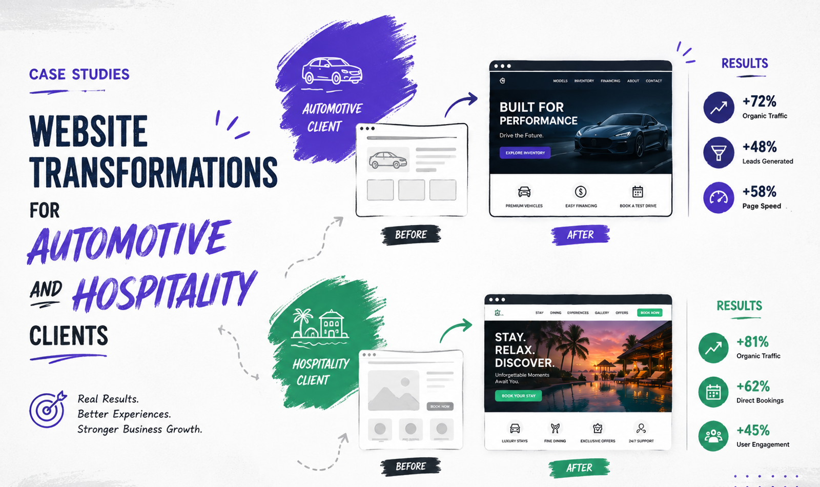
Consider an established automotive dealership representing several vehicle categories. The company has a strong physical presence, experienced sales staff and a recognisable local reputation. However, its website was created several years earlier and no longer reflected the quality of the showroom experience.
The homepage contained several promotional banners competing for attention. Vehicle information was divided across inconsistent pages, and visitors could not easily compare models. Some cars had detailed specifications, while others contained only a short paragraph and one image.
The mobile experience was particularly weak. The navigation occupied too much screen space, tables required horizontal scrolling and enquiry forms were difficult to complete.
Calls to action also lacked consistency. Some pages invited visitors to “Contact Us,” while others used “Know More,” “Enquire” or “Submit.” It was unclear whether a visitor was requesting general information, a quotation or a test drive.
The dealership received website enquiries, but the sales team often lacked enough information to respond effectively. Some submissions did not identify the vehicle, preferred location or intended purchase timeline.
The website was technically operational, but it was not supporting the sales journey efficiently.
Defining the Automotive Transformation Goals
The transformation began by defining the primary website objectives.
The dealership wanted visitors to explore its available vehicles, understand the differences between models and submit better-qualified enquiries. Test-drive bookings and dealership visits were especially important.
The website also needed to strengthen the brand’s digital presentation. The physical showroom offered a polished and professional experience, but the website felt visually inconsistent and transactional.
The transformation therefore focused on four connected goals: clearer vehicle discovery, stronger brand presentation, improved mobile usability and more useful lead capture.
Search visibility was also considered. Each major vehicle category and dealership location needed a clear, indexable page rather than being hidden within a single general section.
Restructuring Vehicle Discovery
The first major change involved the website architecture.
Vehicles were organised into logical categories based on the dealership’s actual offering. The main navigation provided direct access to new vehicles, pre-owned inventory, after-sales services, finance information, dealership locations and contact options.
Each vehicle received a structured detail page.
The page began with a strong image and a clear model name. Important information such as starting price, body type, fuel options and transmission was positioned near the top.
Further sections introduced design, comfort, performance, safety, technology and available variants.
The objective was not to place every technical detail on the first screen. The information was arranged according to the customer’s evaluation process.
Visitors could first understand the character of the vehicle and then explore specifications in greater depth.
Related actions remained visible throughout the page. A customer could request a quotation, book a test drive or locate the nearest dealership without returning to the top.
Improving Vehicle Comparison
The previous website required customers to open several tabs and remember specifications manually.
The transformed experience introduced a clearer comparison process. Visitors could select relevant models or variants and review important differences in a structured format.
The comparison did not attempt to display every possible specification. Too much information would have made the feature difficult to use, especially on mobile.
Instead, it focused on the details most likely to influence an initial decision. These included price range, seating capacity, fuel type, transmission, major safety features and selected technology.
The feature then directed visitors to the complete vehicle pages for further information.
This approach supported comparison without replacing the role of the sales team. It helped customers narrow their options and submit more informed enquiries.
Rebuilding the Visual Identity
The visual transformation was designed to reflect the dealership’s real-world environment.
The website used a cleaner layout, more controlled typography and stronger photography. Instead of placing several offers within the same area, each major section received a clear purpose.
Vehicle imagery was given more space, but practical information remained visible. The design avoided making visitors search through full-screen animations before reaching the content.
A consistent visual system was created for buttons, cards, forms, specification tables and promotional sections.
This improved the website’s sense of quality while making future updates easier. New vehicle pages could follow an established structure rather than being designed individually.
The transformation also considered the relationship between the dealership and the vehicle brands it represented. The website needed its own clear identity without conflicting with the manufacturers’ visual guidelines.
Designing for Mobile Automotive Customers
The mobile website was redesigned as a complete experience rather than a smaller version of the desktop site.
Vehicle cards displayed the model name, key details and a direct path to the full page. Filters were simplified and touch-friendly. Specification sections became expandable so that users could access details without scrolling through extremely long tables.
Calls to action were positioned where they could be reached comfortably. A mobile visitor could enquire, call or request a test drive without searching through the footer.
Forms used appropriate fields and required only the information necessary for the next sales step.
Large images were compressed and delivered according to the screen size. Heavy interactions were reduced where they did not add enough value.
The aim was to preserve the premium automotive feeling while keeping the journey fast and practical.
Creating More Qualified Automotive Enquiries
The enquiry process was redesigned around customer intent.
Instead of using one general form for every request, the website distinguished between test-drive bookings, quotation requests, service appointments and general enquiries.
The relevant vehicle was automatically connected to the form when a visitor began from a model page. This prevented customers from needing to re-enter information and gave the sales team immediate context.
The form collected the preferred location and contact method. Optional fields allowed customers to indicate a purchase timeline or interest in finance.
The number of required fields remained controlled. The objective was to improve lead quality without creating a long qualification questionnaire.
After submission, the confirmation message explained what would happen next. Customers were informed that a representative would review the request and contact them.
This small detail reduced uncertainty and created a more professional experience.
Supporting Local Automotive SEO
The redesigned website gave each dealership location a dedicated page.
These pages included the correct address, contact information, opening hours, services and directions. They also explained which vehicle categories were available at the location.
The content was written for customers rather than duplicated across every city page with only the location name changed.
Vehicle and service pages were connected through relevant internal links. A visitor reading about after-sales maintenance could reach the service-booking page, while a vehicle page could direct users towards finance information.
Page titles, headings and descriptions were rewritten to reflect the actual content and search intent.
Structured information, crawlable navigation and a clean URL system made the website easier to understand and maintain.
The purpose of local optimisation was not to create a large number of thin location pages. It was to provide useful information for people deciding where to visit or contact the dealership.
The Automotive Transformation Outcome
The transformed automotive website created a more coherent journey between discovery and enquiry.
Visitors could understand the dealership’s offering, explore vehicles, compare relevant options and select a meaningful next step.
The new design communicated a stronger sense of professionalism, but the most important improvement was clarity.
Vehicle information followed a consistent structure. Mobile users could complete the same important journeys as desktop users. Forms provided the sales team with better context, and location pages helped connect digital research with physical dealership visits.
The website became a more useful sales-support platform rather than a collection of promotional pages.
For a real published case study, this section should include verified data such as changes in qualified enquiries, test-drive requests, mobile engagement, organic landing-page traffic or form completion. These figures should come from analytics, CRM data and confirmed client reporting.
Hospitality Website Transformation Case Study
The Initial Hospitality Website Challenge
Consider a premium independent hotel or resort located in a competitive destination.
The property offered distinctive rooms, dining, event spaces and local experiences. Its guests appreciated the atmosphere and personalised service. However, the website did not communicate these qualities effectively.
The homepage used outdated photographs and a long introductory paragraph. Room categories were presented as basic names without enough explanation of their differences.
The booking button opened an external system with a visual style that felt disconnected from the website. Visitors could not easily understand whether breakfast, taxes or cancellation options were included until late in the process.
The gallery contained many images but lacked organisation. Room photographs, restaurant images and event pictures appeared within one long collection.
Mobile users experienced slow loading because the website downloaded full-resolution images. The date selector was difficult to use on a small screen, and important policies were placed in downloadable documents.
The hotel depended heavily on third-party booking platforms even though its own website attracted interested visitors.
The transformation needed to improve both the emotional presentation and the practical booking journey.
Defining the Hospitality Transformation Goals
The main goal was to help more visitors understand the property and feel confident booking directly.
The hotel wanted to communicate what made the experience distinctive rather than competing only through price.
The website needed to present accommodation clearly, improve mobile usability and create a more consistent transition into the booking engine.
It also needed to support other revenue areas. Dining, weddings, private events and local experiences deserved stronger presentation instead of being treated as minor footer pages.
Search visibility was important for both branded searches and destination-related discovery. The website needed useful content about the property’s location and experience without becoming a generic travel blog.
Building an Experience-Led Hospitality Homepage
The redesigned homepage began with a clear sense of place.
A strong visual introduced the property, supported by a concise statement explaining its location and distinctive experience.
The booking action remained prominent, but the page did not immediately become a collection of prices and offers.
The following sections introduced accommodation, dining, experiences and the property story. Selected testimonials and practical details helped balance emotional storytelling with confidence.
The content hierarchy was designed for different types of visitors. Someone ready to book could access availability immediately. A person still researching could explore rooms, photographs, experiences and location details.
Seasonal promotions were presented within dedicated sections rather than covering the homepage with competing pop-ups.
This created a calmer and more premium first impression.
Rebuilding Accommodation Pages
Each room or suite category received a dedicated page.
The page explained the atmosphere and intended guest experience before presenting detailed facilities. Information such as occupancy, bed configuration, room size, views and included amenities was easy to identify.
A carefully selected gallery showed the complete space rather than repeating several similar images of the same angle.
Practical information remained close to the booking action. Guests could understand the room and then check availability without navigating through several unrelated pages.
Related room categories were presented only where they helped comparison. The website did not attempt to show every available option on every page.
This structure allowed the property to communicate differences beyond basic size and price.
A family suite could emphasise space and convenience. A premium room could focus on views and privacy. A heritage room could explain its architectural character.
The content made each category easier to understand and more meaningful.
Transforming the Hospitality Gallery
The original gallery contained strong images, but it did not help visitors evaluate the experience.
The transformed gallery was organised into accommodation, dining, property spaces, celebrations and destination experiences.
This allowed visitors to explore the content most relevant to their planned stay.
Images were selected for quality and usefulness. A guest considering a wedding needed to see event spaces and setups, while a leisure traveller needed to understand rooms, common areas and surroundings.
Captions were added when context was helpful. Instead of labelling an image simply as “Restaurant,” the caption could identify the dining venue or experience.
The gallery also connected to relevant pages. A visitor viewing wedding imagery could continue to the celebration page, while a room image could lead to the appropriate accommodation category.
The gallery became part of the customer journey rather than a visual dead end.
Improving the Direct Booking Journey
The direct-booking path was reviewed from the visitor’s perspective.
The main booking form requested dates, number of guests and rooms. It did not require unnecessary information before displaying availability.
The transition into the booking engine maintained consistent visual cues so that guests understood they were continuing through the hotel’s authorised system.
Room names and images matched the main website. When terminology differs between the marketing website and booking platform, visitors may wonder whether they are selecting the correct accommodation.
Rate conditions were explained clearly. Guests could understand whether an option included breakfast, whether it was refundable and when payment was required.
Promotional codes and special offers were handled without making the main booking process more complicated.
The confirmation stage explained the reservation details and provided a clear contact method for assistance.
The booking journey was designed to reduce uncertainty rather than relying only on urgency messages.
Strengthening Trust Before Booking
Hospitality customers often need reassurance that the property will match the experience presented online.
The website used high-quality original photography and avoided misleading image treatments. Accommodation descriptions were accurate and specific.
Guest feedback was placed near relevant sections rather than being isolated within a large testimonial slider.
Location information explained the relationship between the property and nearby attractions, transport points or business areas. An interactive map was supported by written directions so that visitors were not dependent on the map alone.
Policies were written in accessible language and made available before booking. Check-in times, cancellation conditions, child policies and accessibility information were easier to find.
Contact details remained visible, and the website identified the property clearly.
Trust was built through transparency and consistency rather than unsupported claims about being the best hotel in the destination.
Creating Content Around the Destination
The transformed hospitality website included useful destination content connected to the guest experience.
Articles and guides addressed subjects such as the best time to visit, local experiences, nearby attractions and suggested itineraries.
The content remained relevant to the property. It did not attempt to cover every possible travel topic simply to attract traffic.
For example, a resort could publish a two-day local itinerary that begins and ends at the property. A business hotel could explain transport connections and nearby commercial areas. A wedding venue could provide planning information for destination celebrations.
These pages supported early research and provided natural paths towards accommodation, experiences or event enquiries.
The destination content also helped demonstrate local knowledge, which can strengthen confidence among visitors unfamiliar with the area.
Supporting Weddings, Dining and Events
Hospitality websites often focus almost entirely on room bookings even when other services contribute significant revenue.
The transformed website gave weddings, private events and dining their own structured journeys.
The wedding page introduced the venue atmosphere, capacity options, planning support and selected celebrations. It included a gallery and a dedicated enquiry form asking for useful details such as preferred date and approximate guest count.
The dining page presented each venue or experience separately, with menus, timings, reservation options and dietary information where appropriate.
Corporate and private event pages explained spaces, facilities and support services without forcing visitors to download a large brochure before understanding the offering.
Lead capture was adapted to each context. A room-booking customer needed dates and occupancy, while a wedding enquiry required different information.
This approach helped the website support the full business rather than only one transaction type.
Optimising the Hospitality Mobile Experience
The mobile redesign prioritised booking and exploration.
The date selector was easy to use with touch controls. Room cards displayed essential information without requiring visitors to open several layers.
Images were optimised for mobile screens, and unnecessary autoplay media was removed or replaced with lighter alternatives.
A clear booking action remained accessible, but it did not cover important content.
Telephone, directions and enquiry options used mobile-friendly interactions. Long policy documents were converted into readable webpage sections.
The navigation grouped accommodation, dining, experiences, events and essential information logically.
The objective was to allow a guest to complete the entire process through a phone, from initial discovery to confirmed reservation.
The Hospitality Transformation Outcome
The transformed hospitality website created a stronger relationship between inspiration and booking.
Visitors could understand the property’s atmosphere while also accessing the information required to make a decision.
Room pages explained meaningful differences. The gallery became easier to explore. Booking conditions were clearer, and the transition into the reservation system felt more consistent.
The website also represented dining, weddings and experiences more effectively, allowing the property to support several types of revenue.
For a real published case study, verified outcomes could include changes in direct-booking conversion, booking-engine entry, mobile abandonment, wedding enquiries, restaurant reservations or organic traffic to accommodation and destination pages.
Results should be attributed carefully. A website may contribute to improved performance, but seasonal demand, advertising, pricing, availability and operational changes can also affect hospitality bookings.
Comparing the Two Website Transformations
The automotive and hospitality transformations required different content and functionality, but the strategic principles were similar.
Both websites needed to communicate an emotional experience while supporting a practical decision.
The automotive site used visual design to communicate aspiration and product quality, but it also needed specifications, comparison and dealership information.
The hospitality site used imagery to communicate atmosphere and destination appeal, but it also needed room details, policies, availability and booking clarity.
Both projects benefited from a clear information architecture. Visitors needed to find important information without navigating through a complicated menu.
Mobile usability was central to both transformations. A mobile visitor should not receive a reduced version of the experience. They should still be able to compare vehicles, request a test drive, explore rooms or complete a booking.
The forms also needed to reflect the intended action. One general contact form could not effectively support every automotive or hospitality journey.
Finally, both projects required trust. Automotive customers needed confidence in the dealership, vehicle information and follow-up process. Hospitality guests needed confidence in the property, room presentation, policies and booking system.
The Importance of Content in Website Transformations
Content should not be written after the design has already determined how much space is available.
The website structure and content should develop together.
Automotive content must explain products accurately without becoming an unreadable list of specifications. Hospitality content must create emotion without hiding practical details behind poetic language.
A strong transformation identifies the questions visitors need answered and assigns each question to an appropriate page.
The homepage introduces the brand. Category pages support exploration. Detail pages support evaluation. Case studies, testimonials and galleries provide proof. Forms and booking systems support action.
Content also affects search visibility. Search engines need clear headings, descriptive text, crawlable links and meaningful page relationships.
Visual websites still require written context. A gallery containing attractive images may influence a human visitor, but project names, descriptions, captions and surrounding content help explain what the images represent.
The best website content serves both understanding and action.
Technical Performance and Website Quality
Automotive and hospitality websites frequently depend on large image libraries, video, maps, filters and third-party integrations.
These features can improve the experience, but they can also make the website slow and unstable.
Performance should be considered during design rather than treated as a final correction.
Images should be delivered at suitable dimensions. The main visual should load efficiently, while below-the-fold galleries can be delayed until required.
Scripts should be reviewed according to their actual business value. Analytics, chat, maps, advertising pixels, finance calculators and booking tools can collectively create significant processing work.
Third-party systems should also be tested as part of the complete journey. A fast homepage does not create a successful experience when the booking engine or enquiry form is slow.
Technical quality includes accessibility, secure connections, correct status codes, working redirects and reliable form delivery.
A visually strong transformation is incomplete when the technical foundation is weak.
Measuring a Website Transformation
The success of a website transformation should be measured according to the business objectives defined at the beginning.
Automotive measurement may include vehicle-page engagement, model comparison use, test-drive requests, quotation enquiries, service bookings and dealership-direction clicks.
Hospitality measurement may include availability searches, booking-engine entry, completed reservations, room-page engagement, event enquiries and restaurant reservations.
Traffic and time on page can provide context, but they should not be treated as the only indicators of success.
Lead and booking quality also matter.
The business should compare results across devices, traffic sources and page types. A website may perform strongly on desktop but lose mobile customers during form completion.
Measurement should begin before launch so that the business has a reliable baseline.
Analytics events, form confirmations and booking tracking should be tested. Incorrect tracking can create false confidence or hide real improvement.
Qualitative feedback is also valuable. Sales teams, reservation staff and customers may identify issues that numerical reports do not explain.
Lessons From Automotive and Hospitality Website Transformations
The first lesson is that visual redesign should follow strategy. An attractive website will not solve unclear navigation, incomplete information or a weak conversion journey.
The second lesson is that each industry requires specialised content. Automotive customers need structured product evaluation, while hospitality guests need confidence in the experience and booking conditions.
The third lesson is that mobile design must be planned intentionally. Compressing a desktop layout into a smaller screen is not enough.
The fourth lesson is that every major page needs a logical next step. Vehicle pages should connect to test drives or quotations. Room pages should connect to availability. Galleries should connect to projects, experiences or enquiries.
The fifth lesson is that results must be measured honestly. A case study should distinguish between confirmed data and interpretation.
Real client case studies become more persuasive when they explain the initial challenge, strategic decisions and measurable outcome rather than presenting only before-and-after screenshots.
How to Present Real Website Transformation Case Studies
A real case study should begin with the client’s context and challenge.
It should explain why the previous website was no longer suitable and what the business wanted to achieve.
The strategy section should describe the reasoning behind the transformation. It should not simply list services such as design, development and SEO.
The execution section can show how the architecture, visual system, content and functionality changed.
Before-and-after examples are useful when they demonstrate a meaningful difference. They should be supported by an explanation of why the new approach is better.
The results section should include verified data where available. The measurement period and source should be clear.
When exact figures cannot be published, the case study can describe confirmed operational improvements, such as a simplified content-management process or a more structured enquiry flow.
Client quotations should be approved and presented accurately.
A trustworthy case study demonstrates experience without exaggeration.
Frequently Asked Questions
What is a website transformation?
A website transformation is a complete improvement of a website’s strategy, structure, design, content, performance and conversion journey. It is more than changing colours or layouts. A strong transformation focuses on how visitors discover information, evaluate the brand and take meaningful action such as sending an enquiry, booking a service or making a purchase decision.
Why do automotive websites need a specialised redesign strategy?
Automotive websites need a specialised strategy because customers usually compare models, variants, features, pricing, finance options and dealership locations before making contact. The website must organise complex vehicle information clearly while also creating an emotional connection through strong visuals, brand presentation and trust-building content.
Why are hospitality websites important for direct bookings?
Hospitality websites are important because they help guests understand the property, compare rooms, review amenities, check policies and complete bookings directly. A strong hospitality website reduces dependence on third-party booking platforms by creating a trusted, easy and visually appealing booking experience.
What should an automotive website include?
An automotive website should include clear vehicle categories, model pages, specifications, comparison options, dealership location pages, finance information, test-drive booking forms and service enquiry options. It should also work smoothly on mobile devices because many customers research vehicles through their phones before visiting a showroom.
What should a hospitality website include?
A hospitality website should include accommodation pages, room galleries, amenities, dining information, event or wedding pages, location details, guest reviews, policies and a direct booking option. The website should balance emotional storytelling with practical information so guests feel confident before making a reservation.
How does mobile design affect automotive and hospitality websites?
Mobile design has a major impact because many users browse vehicles, hotels and resorts on their phones. A poor mobile experience can make visitors leave before they enquire or book. Clear navigation, fast-loading images, simple forms, readable content and touch-friendly booking or enquiry options are essential for better conversions.
How can a website transformation improve lead quality?
A website transformation improves lead quality by making forms more specific to the visitor’s intent. For example, an automotive website can separate test-drive requests, quotation enquiries and service bookings. A hospitality website can separate room bookings, wedding enquiries, restaurant reservations and event requests. This gives the business better information and helps teams respond more effectively.
Why is content important in website transformation?
Content is important because it explains the brand, answers customer questions and guides users through the decision-making process. Automotive content must present product details clearly, while hospitality content must describe the guest experience, rooms, policies and destination. Good content supports both SEO and conversions.
How should website transformation success be measured?
Website transformation success should be measured through business-focused metrics such as enquiry submissions, test-drive bookings, direct reservations, booking-engine entries, room-page engagement, form completion rates, organic traffic, mobile performance and lead quality. The best measurement connects website activity with real business outcomes.
What is the biggest mistake businesses make during website redesign?
The biggest mistake is focusing only on visual design without improving strategy, content, user experience and technical performance. A modern-looking website will still underperform if visitors cannot find information, compare options, trust the brand or complete the next step easily.
Conclusion
Website transformations for automotive and hospitality clients require much more than a visual refresh.
These industries depend on websites that combine emotional appeal, detailed information and a clear path to action.
An automotive customer needs to discover vehicles, compare options and connect with the right dealership or sales team. A hospitality guest needs to understand the property, evaluate accommodation and complete a trusted booking journey.
The website should support these decisions without unnecessary friction.
A successful transformation begins with research and business objectives. It develops through information architecture, content planning, UX design, visual design and technical implementation.
Mobile usability, performance and accessibility should be included throughout the process rather than checked only before launch.
The automotive case study demonstrates how clearer vehicle discovery, structured comparison and intent-based forms can create a stronger digital sales journey.
The hospitality case study demonstrates how experience-led storytelling, organised room information and a consistent booking path can improve the relationship between inspiration and reservation.
In both cases, the website becomes more valuable when it reflects the quality of the actual business and answers the questions customers need resolved.
A modern website should not function only as an online brochure. It should help the customer move from interest to confidence and from confidence to meaningful action.
When strategy, content, design and technology work together, a website transformation can strengthen brand perception, improve usability and provide a more effective platform for enquiries, bookings and long-term growth.
Ready to Transform Your Website Into a Stronger Business Platform?
Your website should do more than look modern. It should help customers discover your brand, understand your value, trust your business and take action with confidence.
At Double Trouble Studio, we help automotive, hospitality and premium brands build high-performing websites with strategic content, conversion-focused design, strong visual storytelling and complete digital marketing support.
For website development, SEO, content strategy, branding, PR, AI video, digital marketing and creative growth solutions, connect with us today.
📩 info@dtsworld.in 📞 +91 80000 06021 📍 Andheri West, Mumbai
Need this for your brand?
Let DTS build your next campaign.
From PR, celebrity management and events to websites, social media, SEO and AI video production — Double Trouble Studio helps brands grow with strategy and execution.
Discuss Your Requirement →