Luxury Website UX Principles: Minimalism, Speed and Emotional Impact
A luxury website should do more than look visually expensive. It should create a digital experience that feels controlled, effortless, distinctive and emotionally engaging from the first interaction.
When visitors encounter a premium brand online, they begin forming opinions almost immediately. The amount of space surrounding a headline, the quality of a photograph, the speed at which the main content appears and the ease of navigation all influence whether the brand feels genuinely premium.
Luxury website user experience is therefore not created by one visual style or technical feature. It is produced by the relationship between design, content, performance, interaction and brand strategy.
For brands building or transforming their digital presence, professional website development and digital marketing services can bring these creative, technical and commercial elements together within one connected strategy.
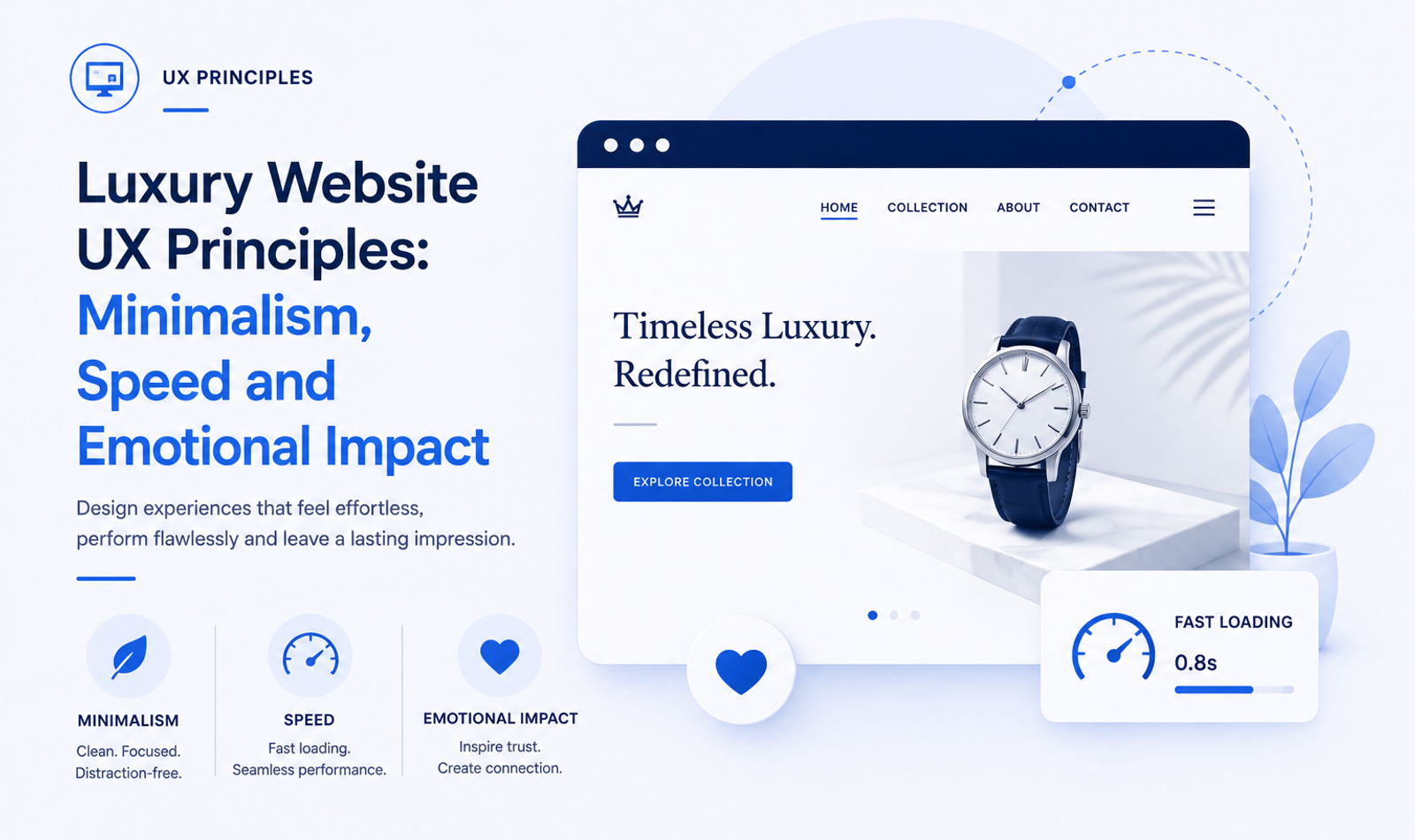
Minimalism helps reduce distraction and gives important elements greater visual value. Speed prevents the experience from feeling heavy or frustrating. Emotional impact helps visitors connect with the brand beyond practical features and specifications.
These principles must work together.
A minimalist website that provides too little information may appear attractive but leave visitors confused. A fast website that lacks visual identity may feel efficient but ordinary. An emotionally impressive website that loads slowly or hides essential actions can damage trust.
The strongest luxury websites combine restraint with clarity, visual atmosphere with practical information and innovation with familiar usability.
They do not attempt to communicate exclusivity by making the customer work harder. They create exclusivity through precision, consistency and thoughtful detail.
Understanding Luxury UX
Luxury UX is the complete experience a person has while interacting with a premium brand online.
It includes what visitors see, how quickly the interface responds, how easily they find information and how they feel as they move through the journey.
The visual design may create the initial impression, but the wider experience determines whether that impression remains credible.
A visitor may be impressed by a cinematic homepage, but that perception can disappear when the navigation becomes confusing. A customer may admire a product page, but trust may decline if the checkout looks generic or unstable.
Luxury UX should continue across the entire website.
The homepage, product pages, service pages, galleries, forms, booking systems and confirmation messages should all feel connected to one brand experience.
Luxury is often associated with rarity, personalisation, craftsmanship and confidence. These qualities can be translated into digital design through selective content, refined typography, careful pacing and clear customer journeys.
The broader principles involved in designing high-end luxury websites show how UX, visual identity, storytelling and technology can work together to strengthen perceived brand value.
The website should not feel crowded or desperate for attention. It should give the impression that every element has been considered.
This sense of intention is one of the strongest differences between a genuinely premium website and a generic website styled to look luxurious.
Begin With the Brand Experience
A luxury website should begin with a clear definition of the experience the brand wants to create.
Different premium brands represent different types of luxury.
A heritage jewellery house may want the website to feel timeless, artistic and authoritative. A modern luxury resort may focus on calm, privacy and escape. A premium automobile brand may communicate precision, performance and technological confidence.
These qualities should influence the complete UX system.
A calm brand experience may use natural imagery, generous whitespace and gentle transitions. A high-performance brand may use stronger contrast, structured layouts and more energetic motion.
The website should not simply copy the visual language of other luxury businesses. Black backgrounds, gold accents and serif fonts do not automatically create a meaningful premium identity.
The experience should be rooted in the brand’s own positioning.
A structured luxury brand strategy roadmap can help define the audience, value proposition, personality and emotional territory before individual website screens are designed.
Before designing individual pages, the business should identify the primary audience, desired emotional response and most important customer action.
It should also define what the brand does not want the website to feel like. It may want to avoid appearing mass-market, overly corporate, excessively decorative or trend-driven.
These decisions provide direction for the UX strategy.
Use Minimalism as a Strategic Tool
Minimalism is one of the most recognisable qualities of luxury website design.
However, effective minimalism is not created by removing content randomly or leaving large areas empty. It is created by deciding what deserves attention and reducing everything that competes with it.
A premium homepage may begin with one strong visual, one carefully written headline and one clear next action.
This gives visitors a focused entry into the brand.
A mass-market page may use several banners, product offers, badges and promotional messages because it is attempting to communicate volume and urgency. A luxury page often communicates greater confidence by saying less at one time.
The brand allows the visual, product or message to hold attention without surrounding it with noise.
This sense of restraint can increase perceived value. When fewer items are presented, each item appears to have been selected intentionally.
However, minimalism should never remove essential information.
A luxury product page still needs details about materials, dimensions, availability, delivery and care. A premium service page still needs to explain its process, expertise and next step.
The goal is not to show less information overall. It is to reveal information through a more controlled hierarchy.
Avoid Empty Minimalism
A common luxury website mistake is confusing minimalism with vagueness.
The website may contain large images and short poetic statements but fail to explain what the brand sells, where it operates or how customers can engage.
This creates visual atmosphere without useful communication.
Visitors should not need to interpret abstract language simply to understand the offering.
A luxury architecture studio can use emotionally expressive copy while still stating that it designs private residences, hospitality spaces or commercial environments.
A premium travel company can create a sense of discovery while explaining its destinations, planning service and booking process.
Minimalism works when the underlying information architecture is strong.
Established UI/UX design principles for high-end brand websites can help teams preserve visual restraint without sacrificing navigation clarity, content hierarchy or conversion paths.
The content may be presented gradually, but it should remain available.
A clear user journey is more luxurious than unnecessary mystery.
Use Whitespace to Create Focus
Whitespace is the open space between and around visual elements.
It allows headlines, photographs, products and calls to action to receive attention without competing against nearby content.
In luxury design, whitespace often creates a slower and more deliberate rhythm.
The visitor is encouraged to focus on one idea or image before moving to the next section.
Whitespace can also improve readability. Paragraphs feel easier to process when they are not crowded against other elements.
The value of whitespace depends on balance.
Too little space makes the page feel dense and promotional. Too much space can make the website feel incomplete or create unnecessary scrolling.
Spacing should be based on a consistent system rather than individual judgement on every page.
The same relationships between headings, paragraphs, images and buttons should appear across the website.
This creates visual consistency and makes the interface easier to maintain.
On mobile devices, spacing should adapt carefully. Large desktop gaps should not simply be transferred to smaller screens where they create excessive scrolling.
Create a Clear Visual Hierarchy
Visual hierarchy determines which elements visitors notice first and how they understand the relationship between them.
Luxury websites often use hierarchy through scale, space and composition rather than loud colours.
A large headline may establish the main idea. A dominant image may communicate the emotional tone. Supporting copy provides context, while a refined call to action guides the next step.
The page should make this order immediately understandable.
When every heading is oversized and every image fills the screen, the website loses hierarchy. Nothing appears more important because everything is treated as a major visual moment.
Premium UX requires variation.
Some sections should feel immersive. Others should be quieter and more informative. This variation creates rhythm and prevents the experience from becoming visually exhausting.
A visitor should be able to scan a page and understand its main structure even before reading every word.
Clear hierarchy is particularly important on service and product pages where emotional storytelling must coexist with practical detail.
Make Typography Part of the Experience
Typography has a major influence on the character of a luxury website.
A well-selected typeface can communicate heritage, modernity, precision or artistic expression before visitors read the message.
Luxury websites often use a distinctive display typeface for headlines and a more readable typeface for body content.
The relationship between these fonts should reflect the brand.
A fashion or jewellery company may use an elegant serif for expressive headings. A premium technology or architecture company may choose a clean, structured sans-serif.
Typography should not be selected only because it appears expensive.
It must remain readable across screen sizes and content types.
Large editorial headlines can create visual impact, but they should scale properly on mobile. Body copy should use a comfortable size, line height and width.
Very light font weights may appear sophisticated on large screens but become difficult to read on mobile devices or low-quality displays.
Letter spacing also requires restraint. Widely spaced uppercase text may work for labels and short navigation items, but it should not be applied to longer paragraphs.
A clear typographic system creates both personality and usability.
Use Colour With Confidence
Luxury websites often use controlled colour systems.
A limited palette allows the brand’s products, imagery and typography to receive greater attention.
Neutral backgrounds are common, but luxury design does not need to be restricted to black, white or beige.
The colour palette should reflect the brand’s identity and physical experience.
A coastal resort may use tones influenced by the landscape. A luxury beauty brand may use warm muted shades. An automotive brand may use stronger dark tones and metallic details.
Colour should support hierarchy.
The strongest brand colour can be reserved for important actions or selected highlights rather than being applied to every component.
Contrast must remain sufficient for readability.
A subtle palette should not result in pale text that visitors struggle to read. Refinement and accessibility can coexist when colour relationships are planned carefully.
The website should also maintain consistency between digital campaigns, social content, packaging and physical environments.
Invest in Original Art Direction
Luxury UX depends heavily on visual quality.
Original photography and video communicate authenticity in a way that generic stock content rarely can.
The brand should plan visual content specifically for the website.
Images may need negative space for headlines, alternative crops for mobile and close-up details for product or material sections.
The visual direction should communicate a consistent world.
Lighting, composition, colour treatment, styling and location should feel connected.
A luxury hotel may combine environmental images with details of materials, food and service. A jewellery brand may use macro photography to reveal craftsmanship. A premium event company may show the scale of the environment alongside smaller emotional moments.
The images should do more than decorate the layout.
They should help visitors understand the product, atmosphere or quality of the service.
Visual content becomes part of the UX when it answers questions and supports decisions.
Create Emotional Impact Through Storytelling
Luxury purchases are rarely based on function alone.
Customers may be purchasing identity, experience, status, memory, personal expression or a sense of belonging.
The website should communicate these emotional dimensions without becoming vague or exaggerated.
Storytelling can explain the founder’s vision, the origin of a material, the character of a destination or the thinking behind a design.
A luxury watch is more meaningful when visitors understand its craftsmanship and heritage. A private resort becomes more desirable when the website communicates the feeling of the place rather than listing facilities alone.
The story should unfold through a combination of writing, imagery, video and pacing.
Not every story requires a long paragraph. A sequence of carefully selected images supported by concise context may create a stronger emotional effect.
The experience should still remain authentic.
Invented heritage and unsupported claims can reduce trust. Emotional impact is strongest when it emerges from genuine qualities of the brand.
Use Sensory Design Carefully
Digital interfaces cannot reproduce every physical sensation, but they can suggest texture, movement, sound and atmosphere.
Close-up photography can communicate the finish of leather, fabric, wood or metal. Video can show movement, scale and natural light.
Sound may add atmosphere in certain campaign experiences, but it should never begin unexpectedly or prevent visitors from controlling it.
Motion can communicate softness, precision, speed or energy depending on how it is used.
A slow image reveal may suit a wellness brand. A sharper transition may support an automotive experience.
Brands that require original cinematic assets can also explore the benefits, costs and use cases of AI video advertising when planning scalable visual campaigns and digital storytelling.
The purpose of sensory design is not to demonstrate technical effects. It is to support the emotional identity of the brand.
Every effect should answer a question: does this make the experience more meaningful or merely more complicated?
Build Emotional Impact Without Sacrificing Clarity
Emotion and information should not compete.
A luxury website can create desire while still answering practical questions.
A hotel room page can describe the view and atmosphere while also stating its occupancy, size and amenities.
A premium interior studio can communicate its design philosophy while explaining the consultation and project process.
Customers need inspiration and reassurance.
When the website provides only emotional language, visitors may admire the brand but remain uncertain about the offering.
When it provides only specifications, the experience may feel functional but fail to communicate value.
The strongest luxury UX combines both.
The emotional story creates interest, while practical detail supports the decision.
Treat Speed as Part of Luxury
A premium website should feel responsive and controlled.
Slow loading weakens the perception of quality because visitors experience delay before they experience the brand.
Luxury websites are particularly vulnerable to performance problems because they often use large images, video, custom fonts and animation.
These elements can support the brand, but they must be delivered efficiently.
Speed should be planned from the beginning rather than treated as a technical correction after the design is complete.
The design team should understand the performance cost of each visual decision.
A large background video may create a strong desktop presentation but cause delay on mobile. Several custom typefaces may add visual variety while increasing loading time.
Every asset should justify its presence.
Following strong technical SEO foundations for speed, mobile usability and Core Web Vitals can help protect both search visibility and the premium quality of the user experience.
A premium experience is not created by placing as much high-resolution media as possible on one page. It is created by delivering selected media smoothly.
Prioritise the Main Content
Visitors should see the page’s main message and visual quickly.
The most important opening image should be optimised and discovered early by the browser.
It should not be delayed unnecessarily behind animation, scripts or loading screens.
Luxury websites sometimes use dramatic preloading experiences because they appear cinematic. However, forcing visitors to watch a logo animation before accessing content can create frustration.
A short transition may be suitable for a campaign microsite, but it should not become a repeated barrier across every visit.
The interface should respect the visitor’s time.
The brand can still create anticipation through pacing and movement after the main content is available.
Optimise Images and Video
Images should be delivered at dimensions appropriate for the device and layout.
A mobile visitor should not download the same oversized file used for a large desktop screen.
Responsive image delivery allows the browser to select a suitable version.
Compression should reduce file size while preserving the quality needed for the brand.
Images below the initial viewport can load later, while the main opening visual should receive greater priority.
The website should reserve space for each image before it appears. This prevents surrounding content from moving unexpectedly.
Video requires even greater control.
Background films should be short, compressed and supported by an appropriate poster image. Mobile visitors may receive a lighter version or a static alternative.
Autoplay video should not include unexpected sound.
The objective is to preserve emotional impact while reducing unnecessary technical weight.
Control Fonts and Third-Party Scripts
Custom typography can strengthen the brand, but every font family and weight adds another resource.
The website should load only the styles it actually uses.
Font delivery should be planned so that text remains visible and layout changes are minimised.
Third-party scripts also require careful review.
Analytics platforms, chat widgets, advertising pixels, maps, booking tools and personalisation systems can collectively create significant delay.
Each tool may provide value, but the website should not load every script on every page when it is not required.
A booking platform may be necessary on reservation pages but unnecessary on an editorial article.
The wider principles in a complete technical SEO website optimisation guide can help teams manage crawling, performance, indexing and technical quality beyond visual design alone.
A luxury website should maintain a controlled technical environment in the same way that it maintains a controlled visual environment.
Design for Responsive Interaction
A website may appear fully loaded while still responding slowly to interaction.
Menus, galleries, product filters and forms should react promptly when visitors use them.
Heavy animation libraries and excessive JavaScript can make simple actions feel delayed.
A button should provide immediate visual feedback. A menu should open smoothly. A form should confirm that information has been received.
The visitor should never wonder whether an action worked.
Responsive interaction is especially important for premium ecommerce and booking experiences.
A delayed size selector, unavailable date picker or unresponsive purchase button creates uncertainty near the point of conversion.
Technical responsiveness contributes directly to emotional confidence.
Maintain Visual Stability
A premium page should remain stable while it loads.
Images, banners and fonts should not push content into new positions unexpectedly.
Visual movement can make the interface feel unfinished and may cause users to click the wrong element.
The website should reserve space for media and embedded components before they appear.
Promotional messages, cookie notices and notification bars should be designed so that they do not unexpectedly shift the main content.
Font choices and fallback styles should also be tested because changes in text dimensions can affect layout.
Visual stability may appear like a technical detail, but it strongly influences perceived polish.
Design Mobile-First Luxury Experiences
Many customers will first encounter a luxury brand through a phone.
They may arrive from social media, organic search, a digital publication or a direct recommendation.
The mobile website should not feel like a reduced version of the brand.
It should preserve visual quality, emotional tone and practical information while adapting to a smaller interface.
Content needs to be prioritised carefully.
Large desktop headlines should scale without breaking into awkward lines. Images need mobile-specific crops. Multi-column layouts should become clear vertical sequences.
Navigation should be easy to open, scan and close.
Buttons should have enough space for touch interaction, and important actions should remain accessible without covering content.
The mobile experience may use less animation and lighter media, but it should still feel intentional.
Keep Navigation Clear
Luxury websites sometimes use unconventional navigation to appear distinctive.
Experimental menus can be effective when the audience understands them, but essential information should not become difficult to find.
Visitors should be able to identify products, services, collections, projects, booking and contact options quickly.
Navigation labels should be understandable.
Words such as “Discover” or “Experience” may support the tone, but they should not replace every familiar category with vague language.
The main menu should remain focused.
Secondary information such as policies, careers and press can appear within the footer or suitable submenus.
On larger websites, filters and search can support exploration, but they should not create additional complexity.
Luxury UX should reduce effort rather than make basic navigation feel exclusive.
Design a Focused Homepage
The homepage should introduce the brand, communicate its primary value and guide visitors towards the most important journeys.
It should not attempt to display every product, service, award and promotional message.
A focused hero section creates the opening impression.
The headline should provide meaning rather than using a vague welcome statement. The visual should establish atmosphere, and the call to action should provide a clear next step.
The following sections can introduce the offering, brand story, selected work, collections or experiences.
The sequence should support the customer journey.
A structured approach to building conversion-focused marketing funnels can help connect homepage messaging with service pages, proof, lead-generation paths and final conversion actions.
A premium service brand may begin with positioning, then show expertise, selected projects and consultation.
A luxury ecommerce brand may introduce the current collection, craftsmanship and featured products.
The homepage should create curiosity without becoming a puzzle.
Design Product Pages Around Confidence
A luxury product page should balance desire with detail.
High-quality photography should allow customers to examine the product closely.
The content should explain the design, materials, craftsmanship and meaning.
Practical information such as dimensions, sizing, availability, delivery and care should remain easy to find.
Minimal design should not hide this information.
The purchase action should be visible and clearly labelled.
Alternative actions can support visitors who are not ready to buy. These may include saving the product, requesting assistance, booking a virtual appointment or finding a showroom.
The product page should also provide reassurance about authenticity, returns and aftercare where relevant.
Customers should feel that the brand has anticipated their questions.
Design Service Pages Around Value
Premium service pages should explain why the service is valuable and how the experience works.
A short list of services is rarely enough for a high-ticket decision.
Visitors may need to understand the process, level of personalisation, project scope and expected collaboration.
The page should explain who the service is for and what makes the approach distinctive.
Case studies and selected work can provide evidence.
Businesses can use their completed work and client projects to demonstrate quality, strategic thinking and execution through real examples rather than relying only on general claims.
Testimonials can address specific areas such as communication, discretion or execution.
The final call to action should reflect the nature of the relationship.
“Begin a Private Consultation” may be more appropriate than a generic “Get Started.”
The page should make the next step feel clear and considered.
Use Calls to Action With Restraint
Luxury brands sometimes hide calls to action because they fear appearing too commercial.
This can leave interested visitors without direction.
A call to action can remain refined while being clear.
The wording should describe the result of the action. “Reserve Your Stay,” “Request a Private Viewing,” “Book a Consultation” and “Explore the Collection” are direct without feeling aggressive.
Each page should have one primary action.
Secondary links can support visitors who want more information.
The call to action should appear after the page has provided enough context, and it may be repeated on longer pages where appropriate.
The visual treatment should fit the brand rather than relying on oversized buttons or bright promotional colours.
Create Premium Forms
Forms should feel like part of the designed experience.
Crowded fields, generic labels and unclear errors can weaken the premium impression at the point of conversion.
The form should request only the information required for the next step.
A consultation form may ask for the visitor’s name, contact details, service interest and short project description.
Additional information can be collected later when the relationship has begun.
Labels should remain visible and easy to understand. Error messages should explain how to correct the issue.
The form should work comfortably on mobile devices.
After submission, the website should confirm success and explain what happens next.
This final communication is part of the UX, not an administrative detail.
Use Animation With Discipline
Animation can strengthen emotional impact and make the interface feel polished.
However, excessive animation can reduce speed, accessibility and clarity.
Movement should support the brand’s character.
A soft fade or slow image reveal may suit a wellness or hospitality brand. A precise horizontal motion may support an architectural or automotive identity.
The visitor should not need to wait for every section to animate before reading it.
Scroll effects should not make navigation unpredictable. Custom cursors should not interfere with buttons. Page transitions should not delay repeated tasks.
The website should also respect users who prefer reduced motion.
The most successful luxury animation is subtle enough to support the experience without demanding attention for itself.
Balance Familiarity and Innovation
Luxury brands often want websites that feel unique.
Originality is valuable, but users rely on familiar conventions to understand digital interfaces.
They expect a logo to lead to the homepage, a menu icon to reveal navigation and buttons to look interactive.
Breaking every convention may create visual distinction but poor usability.
Innovation should focus on the areas where it adds genuine brand value.
The website may use expressive layouts, unusual image compositions or custom transitions while keeping core navigation and conversion actions familiar.
This balance allows the interface to feel creative without becoming difficult.
A premium experience should surprise visitors through quality, not confusion.
Make Accessibility Part of Premium UX
Accessibility should be treated as a quality standard.
A luxury website should be usable by visitors with different visual, motor, auditory and cognitive abilities.
Text and interface elements need sufficient contrast.
Keyboard users should be able to navigate the website and identify the element currently in focus. Important video content should provide captions or suitable alternatives.
Images need meaningful alternative text when they communicate useful information.
Forms require clear labels and understandable errors.
Touch targets should be easy to select, and motion should not make content inaccessible.
Accessibility does not require the website to look generic.
Visible focus states, readable typography and inclusive controls can be designed within the premium visual system.
Attention to accessibility demonstrates the same care the brand claims to apply elsewhere.
Use Content to Support Emotional and Practical Needs
Luxury website copy should feel refined but remain understandable.
Overly complex or poetic language can make the offering difficult to evaluate.
The content should communicate aspiration while providing practical information.
Headlines can create emotional interest. Supporting paragraphs can explain the product, service or experience clearly.
The tone should sound confident rather than exaggerated.
Specific statements usually create greater trust than unsupported claims about excellence or world-class quality.
The content should also remain consistent across the website.
Navigation labels, product descriptions, forms and confirmation messages should all feel as though they belong to the same brand.
A clear content strategy for brand websites can connect blogs, galleries, case studies and lead magnets with the wider customer journey and commercial goals.
Build Trust Through Consistency
Consistency is one of the strongest luxury UX signals.
Typography, spacing, colours, buttons and interactions should follow a defined system.
The booking or checkout experience should not look disconnected from the main website.
Images should share a consistent art direction. Service names and product terminology should not change between pages.
Small inconsistencies can weaken perceived quality.
A premium customer may not consciously identify every mismatch, but the overall experience can begin to feel less controlled.
A design system helps protect consistency as the website grows.
It provides reusable rules while allowing enough flexibility for campaigns, collections and editorial content.
Use Social Proof Selectively
Testimonials, awards, client names and press coverage can build confidence, but they should be curated.
A large wall of badges may make the website feel promotional.
Selected proof placed near relevant decisions is more effective.
A testimonial about project management can appear on a service page. A respected publication feature can support the brand story. Customer feedback about product quality can appear near the relevant collection.
The proof should be authentic and specific.
Luxury customers may value discretion, so not every client or project needs to be publicly identified.
Approved anonymous case studies can still demonstrate expertise.
The purpose of social proof is to reduce uncertainty, not to dominate the design.
Connect UX With Search Visibility
A visually minimal website still needs enough information for visitors and search engines to understand its pages.
Each major product, service, property or collection should have a clear title, heading and written context.
Image-led pages should include relevant descriptions and captions where useful.
Navigation and internal links should remain accessible.
Search optimisation should not force repetitive keywords into the luxury copy.
A strategic approach to SEO for luxury brands can improve positioning, keyword relevance and authority while preserving a refined brand voice.
The objective is to make the brand’s genuine value easy to discover and understand.
Performance also supports the wider page experience. However, fast loading alone does not replace useful content, clear architecture or trustworthy information.
UX and SEO work best when they support the same customer needs.
Test With Real Customers
Design teams understand the website because they created it. New visitors do not have the same knowledge.
User testing can reveal where the experience becomes unclear.
Participants may be asked to find a product, compare accommodation, locate service information or complete an enquiry.
The team should observe their behaviour rather than relying only on their opinions.
A visitor may describe the website as beautiful while struggling to identify the next step.
Testing should include mobile devices and realistic network conditions.
Luxury UX should be evaluated with the people the brand actually wants to serve.
The goal is not to remove every creative feature. It is to confirm that creativity supports rather than obstructs the journey.
Measure Meaningful Experience
A luxury website should be evaluated according to its business purpose.
Important measurements may include qualified enquiries, consultation requests, private-viewing bookings, product purchases, reservation completion and showroom appointments.
Engagement with galleries, films and editorial content can provide supporting insight.
Performance data can identify slow templates and unstable components.
The business should also examine lead quality and customer feedback.
A redesign may produce fewer total enquiries but attract customers who are more aligned with the brand’s positioning and investment level.
Applying conversion optimisation for luxury brands can help businesses evaluate high-ticket customer journeys without relying on aggressive mass-market sales tactics.
Numbers should be interpreted according to the role of each page.
An editorial article may support discovery, while a service page is more directly connected to conversion.
The objective is not to optimise every page for the same action.
Common Luxury UX Mistakes
One common mistake is using minimalism without enough information.
The website appears elegant but fails to explain the offering or customer journey.
Another mistake is allowing animation to delay content. Visitors are forced to wait for transitions before they can navigate.
Large unoptimised media can make the website feel slow, particularly on mobile devices.
Unclear navigation and abstract labels create additional friction.
Some luxury websites prioritise desktop presentation while giving little attention to mobile usability.
Others use low-contrast text, tiny typography or hover-only interactions to preserve a delicate appearance.
Overly poetic writing may create mood but leave practical questions unanswered.
A further mistake is creating a premium opening experience followed by a generic form, checkout or booking platform.
Businesses handling enquiries, reservations or transactions should also follow secure website practices for premium clients to protect user information and reinforce trust throughout the journey.
Luxury UX must remain consistent through the final action.
A Practical Luxury UX Framework
A successful luxury UX process begins with brand strategy and audience understanding.
The team defines the emotional qualities, commercial goals and customer actions the website must support.
Information architecture then organises the content into clear journeys.
Wireframes establish hierarchy and functionality before decorative design begins.
The visual system defines typography, colour, imagery, spacing and motion.
Content explains the offering and communicates the emotional story.
Development protects performance, responsiveness and accessibility.
Testing confirms that visitors can complete important tasks across devices.
Measurement identifies where the experience can be improved after launch.
This process treats minimalism, speed and emotional impact as connected decisions.
Minimalism removes distraction. Speed protects momentum. Emotional design creates memory and desire.
The complete system should make premium interaction feel natural.
Frequently Asked Questions
What is luxury website UX?
Luxury website UX is the complete digital experience a visitor has while interacting with a premium brand online. It includes design, navigation, loading speed, content clarity, mobile usability, emotional storytelling, forms and conversion paths. A strong luxury UX should feel refined, effortless, trustworthy and aligned with the brand’s premium positioning.
Why is minimalism important in luxury website design?
Minimalism is important because it reduces distraction and gives important elements more value. It allows strong visuals, refined typography, clear messages and calls to action to stand out. However, minimalism should not remove essential information. A luxury website should feel clean and focused while still helping visitors understand the brand, product, service and next step.
What is the difference between minimalism and empty design?
Minimalism is intentional, structured and useful. Empty design looks visually clean but fails to explain the offering, customer journey or conversion path. A minimalist luxury website still provides clear content, strong navigation, useful details and a logical next step. Empty design may look premium at first but can leave visitors confused.
How does speed affect a luxury website experience?
Website speed affects how premium and reliable the brand feels. A slow-loading website can make even a beautiful design feel frustrating and poorly managed. Luxury websites often use large images, videos, custom fonts and animation, so these assets must be optimised carefully to keep the experience smooth and responsive.
Why is emotional impact important for luxury websites?
Emotional impact helps visitors connect with the brand beyond practical details. Luxury customers often respond to atmosphere, craftsmanship, identity, aspiration and experience. Strong photography, storytelling, typography, video and pacing help create a memorable brand feeling that supports desire and trust.
How can a luxury website balance emotion and clarity?
A luxury website can balance emotion and clarity by combining storytelling with practical information. For example, a hotel page can describe the atmosphere while also showing room size, amenities and booking details. A service page can communicate brand philosophy while also explaining the process, proof and next step.
Why is mobile UX important for luxury brands?
Many premium customers first discover and explore brands on mobile devices. A luxury website must look refined and function smoothly on mobile, not only on desktop. Mobile UX should include readable typography, optimised images, clear navigation, easy forms and accessible calls to action.
Should luxury websites use animation?
Luxury websites can use animation, but it should be subtle, purposeful and aligned with the brand personality. Animation should guide attention, create atmosphere or improve transitions. It should not slow down the website, delay content, confuse users or make navigation difficult.
What makes a luxury website feel trustworthy?
A luxury website feels trustworthy when it is consistent, fast, clear and professionally designed. Trust is built through high-quality visuals, refined content, clear contact information, useful product or service details, authentic testimonials, smooth forms, secure interactions and a polished mobile experience.
How does UX support conversions for luxury brands?
UX supports conversions by helping visitors move from interest to confidence and then to action. Clear navigation, emotional storytelling, practical details, social proof, refined calls to action and easy forms make it easier for premium customers to enquire, book, purchase or request a consultation without feeling pressured.
What is the biggest UX mistake luxury websites make?
The biggest mistake is focusing only on visual beauty while ignoring usability. A luxury website may look impressive, but if it loads slowly, hides important information, uses unclear navigation or makes forms difficult to complete, the experience fails. True luxury UX combines design, clarity, speed and emotional value.
Conclusion
Luxury website UX principles are based on intentionality.
The website should feel refined because every element serves a purpose, not because it follows a predictable luxury style.
Minimalism creates focus when it removes distraction without removing essential information.
Whitespace, typography and visual hierarchy allow the most important content to receive attention.
Speed protects the experience by reducing waiting, delayed interaction and visual instability.
Premium imagery, video and animation should be optimised so that emotional impact does not come at the cost of performance.
Emotional storytelling gives the brand meaning beyond practical features. It helps customers understand craftsmanship, identity, place and experience.
However, emotion should remain supported by clarity.
Visitors still need understandable navigation, detailed information and a clear next step.
Mobile design, accessibility and technical responsiveness are not secondary concerns. They are part of the quality the brand promises.
The strongest luxury websites combine aesthetic restraint with functional confidence.
They do not attempt to impress by adding more effects or hiding information. They create value through selection, consistency and attention to detail.
When minimalism, speed and emotional impact work together, the website becomes more than a digital presentation.
It becomes a premium brand experience that feels memorable, trustworthy and effortless from the first impression to the final conversion.
Ready to Create a Luxury Website Experience for Your Brand?
Your luxury website should do more than look beautiful. It should feel refined, load smoothly, tell your brand story, guide visitors clearly and convert the right audience into meaningful enquiries, bookings or purchases.
At Double Trouble Studio, we help luxury and premium brands create high-performing websites with refined UI/UX, minimal design systems, emotional storytelling, speed optimisation, SEO, digital marketing, PR, AI video and complete creative growth solutions.
Businesses searching for website development and digital marketing services in Mumbai can work with our team across strategy, UI/UX, content, development, technical optimisation and long-term digital growth.
Contact Double Trouble Studio for luxury website UX, premium website design, speed optimisation, UI/UX, SEO, branding, PR, AI video, digital marketing and creative strategy.
📩 info@dtsworld.in 📞 +91 80000 06021 📍 Andheri West, Mumbai
Need this for your brand?
Let DTS build your next campaign.
From PR, celebrity management and events to websites, social media, SEO and AI video production — Double Trouble Studio helps brands grow with strategy and execution.
Discuss Your Requirement →