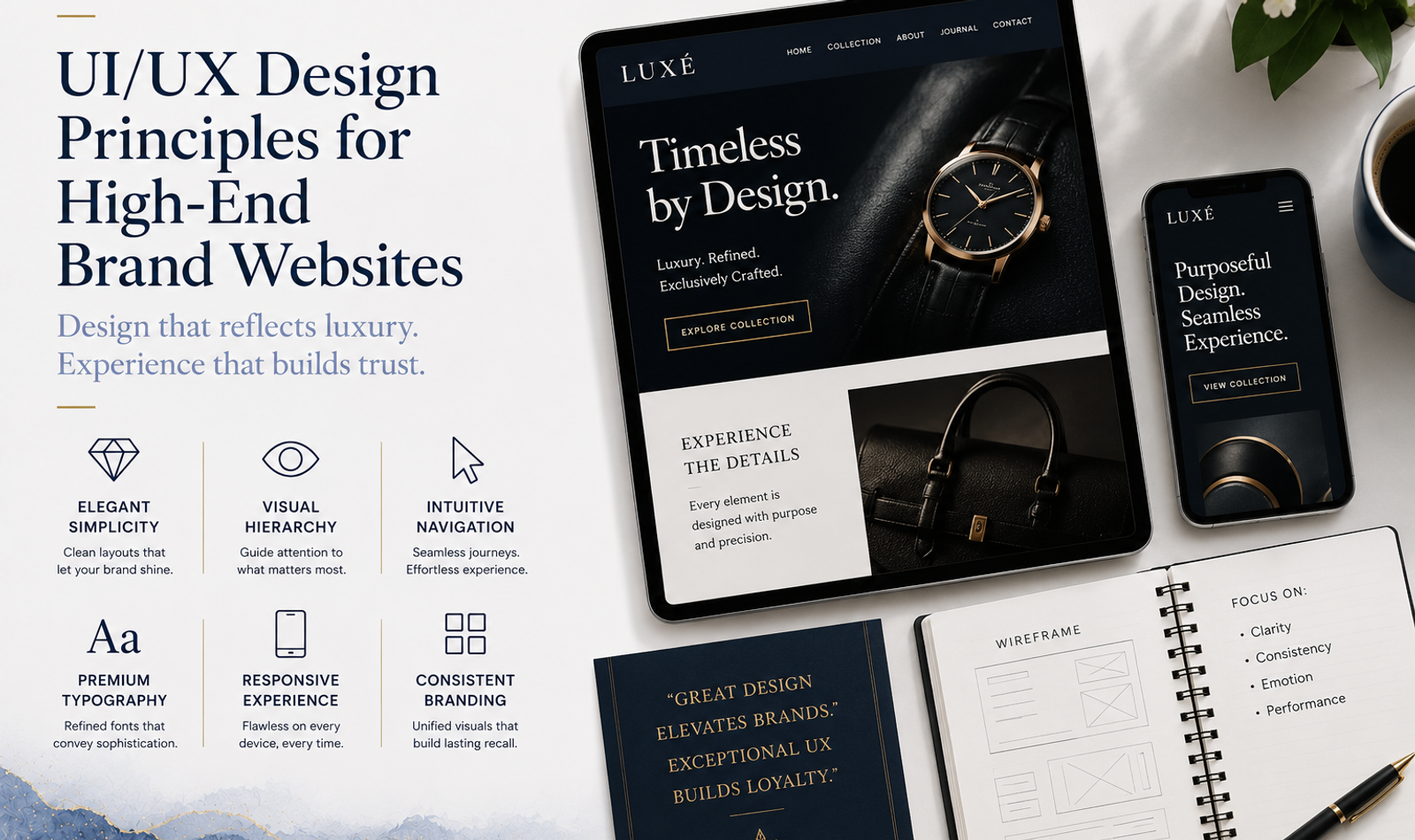
UI/UX Design Principles for High-End Brand Websites
A high-end brand website is not simply a digital brochure with elegant fonts, expensive photography and large amounts of white space.
It is a carefully designed digital brand experience.
For luxury, hospitality, fashion, real estate, interiors, jewellery, automotive and premium professional-service brands, a website often becomes one of the most important places where potential customers evaluate credibility.
A customer may first discover a brand through Instagram, Google, an advertisement, PR coverage or a recommendation. Before making an enquiry, they may visit the website to understand the company, explore its work, compare it with competitors and decide whether the brand feels credible enough for their requirements.
This is why effective web development and digital marketing should consider UI, UX, branding, content, technology, SEO and conversion together.
UI, or User Interface Design, determines how the website looks: typography, colours, buttons, imagery, layouts, spacing and visual hierarchy.
UX, or User Experience Design, determines how the website works for the person using it: navigation, accessibility, page structure, speed, information flow and ease of completing an action.
For a premium brand, one cannot compensate for the other.
A visually impressive website with confusing navigation creates frustration. A perfectly functional website without a distinctive visual identity may fail to communicate premium value.
The objective is to create an experience that feels refined, intuitive, fast, distinctive and completely consistent with the brand.
What Makes a Website Feel High-End?
A high-end website is usually defined less by the number of design elements it contains and more by how carefully those elements are controlled.
Premium digital experiences often use:
- Strong visual hierarchy
- High-quality original imagery
- Refined typography
- Generous but purposeful spacing
- Simple navigation
- Controlled animation
- Fast loading
- Clear storytelling
- Consistent design systems
- Thoughtful mobile experiences
- Strong calls to action
- Carefully structured content
Luxury does not necessarily mean complexity.
In many cases, the most sophisticated website is the one that removes everything the visitor does not need.
Before designing individual pages, brands should therefore understand their positioning, customer and communication strategy. A broader PR, media and marketing strategy can also help ensure that the experience customers receive on the website remains consistent with what they see through campaigns, media coverage and social platforms.
1. Begin With Brand Positioning, Not Website Trends
One of the biggest mistakes in premium website design is beginning with references.
A brand finds several websites it likes and asks the designer to combine elements from each.
The result may look attractive, but it may not communicate anything distinctive about the actual brand.
UI/UX should begin by answering:
Who is the customer?
What does the brand represent?
What separates it from competitors?
What level of customer does it want to attract?
What should someone feel within the first few seconds?
What is the primary action the website should generate?
A luxury interior studio may require an editorial, calm and architectural experience.
A hospitality company may need immersive destination storytelling.
A premium technology company may require precision, clarity and authority.
An events and weddings brand may require cinematic visuals, emotional storytelling and strong evidence of execution capability.
The visual language should emerge from positioning rather than from a generic idea of what "luxury" looks like.
2. Create a Clear Visual Hierarchy
A visitor should not have to decide what to look at first.
Good UI establishes hierarchy immediately.
The homepage may begin with:
Primary brand proposition → Supporting explanation → Visual proof → Call to action
Hierarchy can be controlled through:
- Font size
- Typography weight
- Spacing
- Alignment
- Contrast
- Image scale
- Position
- Motion
When every heading is large, nothing feels important.
When every section contains animation, nothing feels special.
When every button has a different treatment, the visitor has to repeatedly understand the interface.
Premium websites guide attention rather than compete for it.
3. Use White Space Intentionally
White space is one of the most effective tools in high-end digital design.
It creates separation between information and gives important elements room to breathe.
It can be used around:
- Headlines
- Images
- Product information
- Service descriptions
- Testimonials
- Calls to action
- Navigation
- Case studies
Dense interfaces can make even an expensive brand feel transactional.
However, white space should not become excessive emptiness.
A user should not need to scroll through several screens simply to reach the next meaningful piece of information.
The objective is visual rhythm, not emptiness.
4. Treat Typography as Part of the Brand Identity
Typography can dramatically influence how a website feels.
Serif typography may communicate heritage, editorial sophistication, craftsmanship or elegance.
Sans-serif typography can communicate modernity, precision and simplicity.
The combination depends on the brand.
A luxury fashion label may use expressive editorial typography, while a premium consulting business may need a restrained, highly readable system.
The important principle is consistency.
A website rarely needs five different typefaces.
One primary family and one complementary family can often create enough distinction.
Body copy must remain readable, particularly on mobile devices.
Typography should consider:
- Font size
- Line height
- Letter spacing
- Paragraph width
- Contrast
- Heading hierarchy
Beautiful typography that is difficult to read is poor UX.
5. Use High-Quality Original Visuals
For premium brands, imagery is not decoration.
It is evidence.
A hotel website should allow visitors to understand the environment.
An interior studio should demonstrate its design language through real projects.
A fashion label should communicate material, styling and craftsmanship.
An event company should demonstrate scale, atmosphere, production and guest experience.
Brands that regularly create campaigns may benefit from professional AI video and VFX production alongside original photography and conventional video production, particularly when creating visual concepts, campaign assets and digital storytelling.
Whatever the production method, visuals must remain consistent with the brand.
Mixing beautiful original photography with generic stock imagery can immediately reduce perceived quality.
6. Use Motion With Restraint
Animation can make a premium website feel sophisticated.
It can also make it exhausting.
Useful motion may include:
- Controlled image reveals
- Subtle fades
- Hover interactions
- Smooth page transitions
- Product interactions
- Micro-animations
- Scroll-triggered storytelling
Motion should help the user understand the experience.
It should not exist merely because the technology allows it.
Long loading animations, excessive parallax, constant movement and complicated transitions may appear impressive during a presentation but become irritating during repeated website use.
A useful principle is simple:
If removing an animation makes the experience easier without losing meaning, the animation may not be necessary.
7. Keep Navigation Simple
High-end does not mean mysterious.
A visitor should quickly understand where to find important information.
Depending on the business, navigation may include:
- About
- Services
- Work
- Collections
- Locations
- Journal or Blog
- Contact
For a service-led company, a clear work and portfolio section can be particularly important because customers often want proof before they want a sales conversation.
Unconventional navigation can occasionally work for highly creative brands, but basic usability should not be sacrificed for novelty.
A customer who wants to contact the business should not need to discover a hidden interaction first.
8. Design Around the Customer Journey
Good UX is based on intent.
Different visitors arrive with different questions.
A first-time visitor may want to understand the brand.
A returning visitor may want to review a project.
A high-intent prospect may want to enquire immediately.
The website should support all three.
For a professional service business, a typical journey could be:
Homepage → Service → Work → About → Contact
For an experience-led company:
Discovery → Experience → Proof → Availability → Enquiry
For businesses providing complex services such as celebrity management, the website may need to establish expertise and process before encouraging the customer to submit a requirement.
UX should therefore be designed around actual customer questions rather than simply around a collection of pages.
9. Make Mobile Design a Priority
Many premium customers will first encounter a brand through Instagram, Google, LinkedIn or digital advertising on a smartphone.
The mobile experience cannot be treated as a compressed version of desktop.
Designers should specifically evaluate:
- Navigation
- Font size
- Button size
- Image crops
- Video behaviour
- Forms
- Sticky elements
- Spacing
- Loading speed
- Calls to action
A cinematic desktop homepage is of little value if the mobile version loads slowly or cuts important visual content incorrectly.
Mobile UX should receive the same design attention as desktop.
10. Website Speed Is Part of Premium Experience
A customer should not have to wait for the brand experience.
Heavy videos, unnecessary JavaScript, oversized images, multiple font files and third-party scripts can significantly reduce website performance.
Developers should optimise:
- Images
- Video delivery
- Fonts
- Scripts
- Caching
- Lazy loading
- Code structure
- Third-party integrations
A premium website should feel responsive.
Speed is not simply a technical SEO consideration. It affects perception.
A fast interaction feels polished.
A delayed interaction feels unfinished.
11. Build Clear Calls to Action
Some premium brands make the mistake of becoming so minimal that customers cannot determine what to do next.
Premium does not mean vague.
Calls to action can remain elegant while being direct.
Examples include:
Request a Private Consultation
Explore Our Work
Schedule a Meeting
Check Availability
Plan Your Experience
Request a Proposal
A strong contact experience should make it easy for a qualified visitor to move from consideration to conversation.
The CTA should also match the buying stage.
Someone reading an educational article may not be ready for a proposal. Someone who has reviewed several projects and service pages may be.
12. Use Proof Instead of Generic Luxury Claims
Words such as:
"premium"
"world-class"
"exclusive"
"bespoke"
"unmatched"
have limited value without evidence.
Premium customers want proof.
Useful trust signals may include:
- Previous clients
- Case studies
- Testimonials
- Awards
- Media coverage
- Certifications
- Founder expertise
- Completed projects
- Years of experience
A carefully designed About page can also establish the people, philosophy and experience behind the business.
The objective is not to fill every page with logos.
Proof should appear naturally where uncertainty is likely to arise.
13. Build Strong Case Studies
Case studies are particularly valuable for high-value services.
Instead of simply stating that the company produces excellent work, demonstrate it.
A case study can explain:
Challenge → Strategy → Execution → Result
For an event business, this might include venue transformation, production, hospitality, entertainment and logistics.
For an agency, it might explain branding, website development, content, PR and digital growth.
For businesses handling complex attendee experiences, demonstrating expertise in areas such as guest management can help potential clients understand operational capability beyond visual execution.
Case studies turn claims into evidence.
14. Design Forms for Qualified Conversions
Forms should collect enough information to support a useful conversation without becoming exhausting.
Depending on the service, useful fields may include:
- Name
- Phone
- Company
- Service required
- Location
- Timeline
- Budget range
- Message
Do not ask for information simply because a CRM supports another field.
Every additional question creates friction.
For high-value services, qualification is useful, but the experience should still feel welcoming.
After submission, the website should clearly explain what happens next.
15. Maintain a Consistent Design System
Premium design depends heavily on consistency.
The website should establish rules for:
- Typography
- Colours
- Buttons
- Forms
- Icons
- Cards
- Borders
- Image ratios
- Spacing
- Motion
- Section structure
A visitor may never consciously identify these rules.
They will notice when they are absent.
A consistent interface feels intentional.
An inconsistent interface feels assembled.
16. Make Accessibility Part of Good Design
Luxury should never mean difficult to use.
High-end websites should maintain:
- Readable text
- Suitable contrast
- Keyboard-friendly navigation where appropriate
- Clear interactive states
- Descriptive image information
- Understandable forms
- Controlled motion
Very light grey text on a white background may appear visually refined but can be difficult to read.
Tiny typography may look editorial on a large monitor but become uncomfortable on a phone.
Accessibility and premium design can coexist.
17. Build Emotional Storytelling Into the Experience
Premium purchases are rarely based only on specifications.
Emotion matters.
A destination wedding website may communicate anticipation, celebration and scale.
A luxury hospitality brand may communicate privacy and escape.
An interior studio may communicate calm, proportion and materiality.
A premium automotive brand may communicate engineering and performance.
For luxury celebrations, the digital storytelling should feel consistent with the quality promised through the actual events and weddings experience.
Emotion can be created through photography, copy, typography, pacing, motion and layout.
The important point is that the emotional direction should be intentional.
18. Create a Content Hierarchy
Users do not read websites from beginning to end like books.
They scan.
A well-designed page should therefore communicate its primary meaning even when someone reads only:
- Headings
- Subheadings
- Highlighted statements
- Captions
- CTAs
Long-form information can still exist for customers who need detail.
The hierarchy should allow both quick scanning and deeper exploration.
This is particularly important for high-consideration services where different decision-makers may require different levels of information.
19. Integrate SEO Without Damaging the Design
Luxury website design and SEO should not be treated as opposing objectives.
A premium site can remain visually refined while including:
- Clear H1 and H2 structures
- Relevant page copy
- Descriptive URLs
- Internal links
- Image alt text
- Fast loading
- Mobile optimisation
- Metadata
- Structured content
A strong website development and marketing strategy should consider search visibility while the information architecture is being designed, rather than adding SEO after the site has already been completed.
A website containing almost nothing except large images and poetic one-line statements may look attractive but give search engines and customers very little information.
20. Create Dedicated Service Pages
A premium service business should not expect its homepage to explain everything.
Important offerings deserve dedicated pages.
A service page should typically answer:
- What is the service?
- Who is it for?
- What problem does it solve?
- What does the process involve?
- What evidence supports the company?
- What should the customer do next?
For example, a company offering PR and media marketing should provide enough information for someone specifically looking for PR support without requiring them to navigate through unrelated offerings.
Dedicated service pages improve both customer experience and organic search structure.
21. Use Location Architecture Strategically
Businesses serving multiple cities may require location-specific experiences.
A customer looking for services in Mumbai may have different expectations from someone planning an event in Goa or Udaipur.
Location pages can help communicate geographic capability while also supporting local search.
However, these pages should provide useful local relevance.
Copying the same page thirty times and changing only the city name creates little customer value.
A central locations section can help users discover where services are available and navigate to relevant geographic information.
22. Use the Blog as Part of the Customer Experience
A blog should not exist only to publish SEO keywords.
It can help customers understand complicated purchasing decisions.
A useful blog and insights section may answer questions about:
- Pricing
- Processes
- Comparisons
- Trends
- Timelines
- Strategy
- Common mistakes
- Planning frameworks
For premium businesses, educational content can establish expertise before the customer speaks with the sales team.
The blog therefore becomes part of UX, SEO and lead nurturing simultaneously.
23. Design the Footer Properly
The footer is often the final navigation point on a page.
It should help visitors continue their journey.
Useful footer information may include:
- Services
- About
- Work
- Locations
- Blog
- Contact information
- Social channels
- Legal information
The footer should remain organised and readable.
It should not become a storage area for every link that could not fit elsewhere.
24. Pay Attention to Microcopy
Small pieces of interface copy have a large effect on experience.
Instead of a generic button such as:
Submit
a premium consultation form could use:
Request a Consultation
Instead of an unclear error:
Invalid Input
the website can explain exactly what needs to be corrected.
Microcopy includes:
- Button labels
- Form instructions
- Confirmation messages
- Error messages
- Navigation labels
- Empty states
The language should reflect the brand voice while remaining immediately understandable.
25. Test the Website With Real Users
Designers, developers and business owners become familiar with their own website.
Customers do not.
User testing can reveal problems that internal teams stop noticing.
Watch whether people can:
- Understand the company quickly
- Find a specific service
- Locate previous work
- Understand the navigation
- Find contact information
- Complete a form
- Use the website comfortably on mobile
Even a small number of relevant users can reveal significant usability issues.
26. Measure What Happens After Launch
A website is not finished when it goes live.
Analytics should help identify how people actually use it.
Useful measurements may include:
- Landing-page performance
- Conversion rates
- Form completions
- Mobile engagement
- Page speed
- Exit pages
- Important page journeys
- Search visibility
- Qualified enquiries
The objective is not to redesign the website every month.
It is to identify genuine friction and continuously improve the experience.
UI/UX and Conversion Design
Premium website UX ultimately needs to support business outcomes.
This does not mean filling every page with sales buttons.
It means creating a logical progression from interest to confidence to action.
Consider a potential client who discovers a premium agency through digital advertising.
They land on the website.
They understand the positioning.
They explore services.
They review previous work.
They learn about the company.
They read an article demonstrating expertise.
They finally make contact.
Every stage reduces uncertainty.
That is conversion-focused UX.
The best conversion design does not feel like pressure.
It feels like clarity.
Common UI/UX Mistakes on High-End Brand Websites
One common mistake is confusing luxury with complexity.
Brands introduce unusual menus, oversized transitions, hidden cursors, continuous animation and experimental layouts because they want the website to feel different.
Another mistake is excessive minimalism.
Important service information disappears because the brand wants every page to remain visually clean.
Other common problems include:
- Designing primarily for desktop
- Using tiny text
- Poor colour contrast
- Slow full-screen videos
- Generic stock imagery
- Too many fonts
- Inconsistent buttons
- Unclear CTAs
- Complicated enquiry forms
- Missing service information
- Weak SEO structure
- Poor mobile navigation
- No clear proof
- Excessive pop-ups
A premium website should reduce effort.
It should not make customers work harder in the name of exclusivity.
A Practical High-End Website Design Process
A structured UI/UX process can follow these stages:
1. Brand Discovery
Understand positioning, audience, competitors, personality and commercial goals.
2. Customer Journey Mapping
Identify how different visitor groups discover, evaluate and contact the brand.
3. Information Architecture
Define pages, navigation, hierarchy and internal relationships.
4. Wireframing
Plan content and functionality before visual decoration.
5. Visual Direction
Develop typography, colour, imagery, spacing and UI components.
6. Content Development
Write clear copy around customer questions and search intent.
7. UI Design
Create desktop and mobile interfaces.
8. Development
Build the experience with performance and responsiveness in mind.
9. SEO Implementation
Configure headings, metadata, internal linking, technical structure and content.
10. Testing
Review usability, mobile layouts, browsers, forms, links and performance.
11. Analytics Setup
Measure meaningful actions and conversions.
12. Launch and Optimisation
Use real customer behaviour to improve the website over time.
This creates a website based on strategy rather than decoration.
High-End Website UI/UX Checklist
Before launching a premium website, evaluate:
Brand
- Is the positioning immediately understandable?
- Does the website feel distinctive?
- Does the design reflect the desired market position?
UI
- Is typography consistent?
- Is spacing controlled?
- Are images high quality?
- Is animation purposeful?
- Are UI components consistent?
UX
- Is navigation intuitive?
- Can visitors find important information quickly?
- Is the mobile experience strong?
- Are forms easy to complete?
- Are CTAs clear?
Performance
- Does the website load quickly?
- Are images and videos optimised?
- Are unnecessary scripts controlled?
Trust
- Are projects, testimonials or case studies available?
- Is the company clearly identifiable?
- Is contact information easy to find?
SEO
- Does each important service have a suitable page?
- Are headings structured properly?
- Is there enough meaningful content?
- Are pages internally connected?
- Are images appropriately described?
Conversion
- Is there a clear next step?
- Does the website qualify without creating excessive friction?
- Can high-intent customers contact the business easily?
Frequently Asked Questions
What is UI/UX design for a high-end brand website?
UI/UX design combines the visual interface of a website with the way customers navigate and interact with it. For high-end brands, the objective is to create an experience that feels premium while remaining intuitive, fast and conversion-friendly.
What makes a website look luxurious?
Luxury website design often uses strong typography, high-quality imagery, controlled colour palettes, generous spacing, thoughtful animation and consistent layouts. The exact design should reflect the individual brand rather than rely on a generic luxury template.
Is minimalism necessary for luxury websites?
No. Minimalism is one possible approach. Fashion, hospitality, art and entertainment brands may benefit from more expressive digital experiences. The design style should follow positioning and customer expectations.
Why is UX important for premium brands?
High-value customers often spend more time researching before making a decision. Poor navigation, slow loading or confusing information can reduce trust even when the brand itself is strong.
Should luxury websites use animation?
Yes, when it has a purpose. Animation can improve storytelling and interaction, but excessive motion can distract users, reduce performance and make mobile experiences frustrating.
Can a luxury website be SEO-friendly?
Yes. SEO and premium design can work together. Clear headings, structured content, relevant copy, internal linking, page speed and technical optimisation can improve visibility without damaging the visual experience.
Should high-end websites display pricing?
It depends on the business model. Product businesses may require transparent prices, while customised premium services may use starting prices, ranges or consultation-based quotations. Pricing decisions should support customer qualification.
How important is mobile UI/UX?
It is essential. Social media, search and advertising frequently send users to websites through mobile devices. A premium website should provide an equally strong experience across screen sizes.
What pages should a premium service website include?
Most service-led premium websites benefit from a homepage, about page, individual service pages, portfolio or case studies, locations where relevant, blog or insights section and contact page.
How often should a high-end website be redesigned?
There is no fixed schedule. A website should be redesigned when positioning, technology, customer expectations or business requirements have changed significantly. Smaller UX and performance improvements should happen continuously.
Conclusion
UI/UX design for a high-end brand website is not about making every page look expensive.
It is about creating a digital experience that feels as considered as the brand itself.
Typography, imagery, spacing and animation establish visual perception.
Navigation, content architecture, mobile responsiveness and speed determine usability.
Case studies and trust signals build confidence.
SEO improves discoverability.
Clear conversion paths turn interest into action.
The strongest high-end websites bring all of these elements together.
They do not overwhelm customers with design.
They guide them.
They do not hide important information to appear exclusive.
They make the right information easy to discover.
And they do not treat branding, UX, development, SEO and conversion as separate activities.
They build one connected digital experience.
For premium businesses, that distinction matters because the website is often where a customer decides whether the quality promised by the brand is genuinely reflected in the experience it delivers.
Build a Digital Experience That Matches Your Brand
A premium brand deserves more than a visually attractive website.
At Double Trouble Studio, we combine strategy, UI/UX, website development, content and digital marketing to build online experiences designed around brand perception, customer journeys and business growth.
Explore our website development and digital marketing services, review our work, or contact Double Trouble Studio to discuss your website requirements.
📩 info@dtsworld.in 📞 +91 80000 06021 📍 Andheri (West), Mumbai
Need this for your brand?
Let DTS build your next campaign.
From PR, celebrity management and events to websites, social media, SEO and AI video production — Double Trouble Studio helps brands grow with strategy and execution.
Discuss Your Requirement →